Design and Research On the colour design of scientific publications
In the age of online publications, colour illustrations have become ubiquitous. However, accessibility and accuracy often fall by the wayside when it comes to colour illustrations. People with colour perception deficiencies – after all, around four per cent of the population – suffer particularly, as a large proportion of the illustrations in scientific and popular science publications are no longer accessible to them. This trend is in clear contrast to the guiding principles of inclusive and open science. We talked about this with Dr Felix Kaspar from the Institute of Biochemistry, Biotechnology and Bioinformatics, who, together with the Swiss geologist and designer Dr Fabio Crameri, published the article “Coloring Chemistry – How Mindful Color Choices Improve Chemical Communication” in the journal “Angewandte Chemie”.
Dr Kaspar, how did you come across this topic?
The topic touches me almost every day: As an author, reader or reviewer of articles, I see scientific illustrations and diagrams every day. Almost all of them are in colour. While colour sometimes serves only as an artistic and supporting element, in many illustrations colour is used (often unintentionally) as an information-coding element. Whenever an illustration requires a reader to clearly assign a colour tone between, for example, a legend and a graph, colour provides a level of coding. Anyone who has ever printed an article in greyscale knows what it means when this code is no longer legible due to unfavourable colour choices: Information is lost. In order to ensure that all readers have complete and undistorted access to the information content of an image, it is necessary to use the appropriate colour combinations or design principles.
What role does biochemistry play in this?
In biochemistry – as in all life sciences – coloured or multidimensional images are relatively modern phenomena. In addition, courses on science communication or the design of illustrations are usually not part of the normal curriculum in the life sciences. So, many never have contact with the subject. This is reflected accordingly in the literature. Our sample of leading chemistry journals last year showed that more than 70 per cent of all articles contain illustrations whose information content is only partially or not at all accessible to readers with colour perception disabilities. So as a scientific society, we need to do more to communicate and establish good practices.
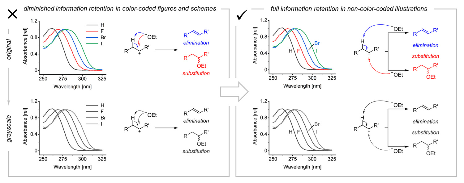
In order for readers to grasp all the information correctly, the colouring in scientific illustrations should only be optional, i.e. not the sole descriptive feature. Picture credits: Kaspar/Crameri
What are the most important design principles?
Basically, it can be condensed to two guiding principles: First, colour recognition should be optional to access the information content of an image. In other words, if possible, colour should not be an information carrier. This means that my image is fully readable even if I reduce its colour content partially or completely. In principle, this can also be achieved by not using any colour at all and only working with greyscales, but that is a question of personal taste.
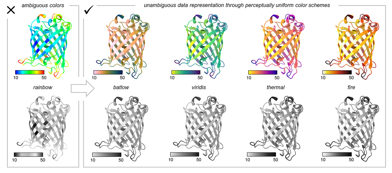
Intuitive colour schemes: To make colour-coded information accessible to all readers, uniformly perceptible colour schemes (scientific colour maps) should be chosen. This example shows B-factors of a fluorescent protein. Picture credits: Kaspar/Crameri
Secondly, when colour is needed or beneficial for conveying information, uniformly perceptible colour schemes should be used. For many purposes, especially for multidimensional data, colour is a really useful tool. However, to prevent my choice of colour from distorting the underlying data (as the rainbow scheme does, for example) or making my illustration inaccessible to some readers, it is important to choose a suitable colour scheme. Such uniformly perceptible colour schemes (also known as scientific colour maps) are characterised by the fact that they are accessible to all readers, do not introduce artefacts into illustrations and can be read intuitively. Many such schemes are available online or already implemented in newer versions of scientific software packages. Most scientists will have come across the schemes viridis (yellow-green-dark blue) or thermal (yellow-orange-dark purple).
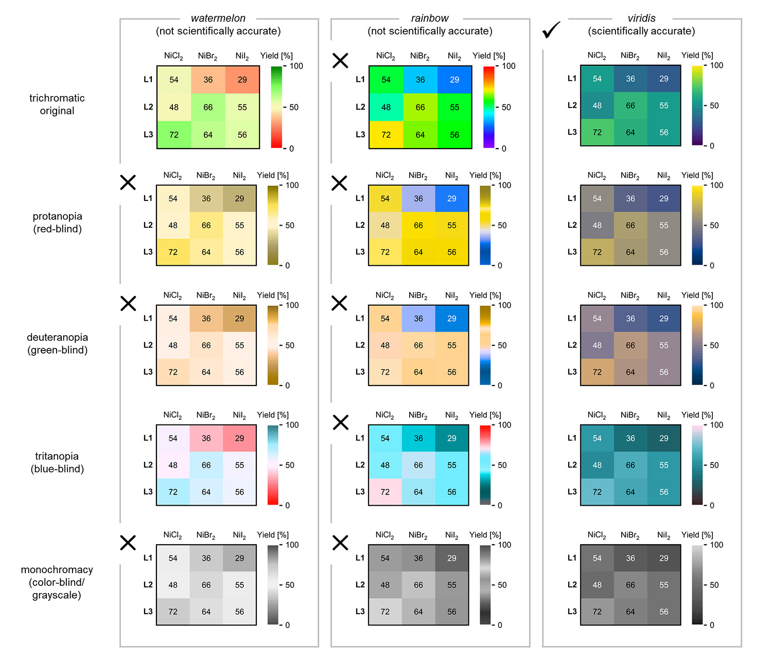
Comparison of different colour schemes in illustrations and their perception with limited colour perception. Picture credits: Kaspar/Crameri
You developed these design and colour rules for the life sciences. Are they also transferable to all other fields of science?
Absolutely! The same basic principles apply across the board, regardless of what types of illustrations you use. For our article, we have only chosen examples with which as large a cross-section of life scientists as possible can identify, and in order to address a group that has not yet come into contact with the topic very often.